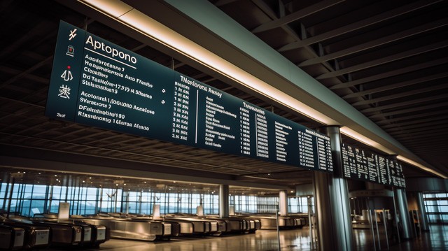
Kiosk Design
Heuristic Evaluation
Infosys | Wongdoody
What I owned

What the data wasn't telling us
The brief was deceptively simple: improve the kiosk check-in experience.
When I examined the existing system, I found a kiosk that technically worked. It supported international travel, military personnel with special allowances, group bookings, and complex itineraries. On paper, it handled everything. The problem wasn't what it couldn't do. It was what the data had hidden from everyone looking at it.
Infosys is one of the world's largest technology services companies, building and maintaining enterprise systems at global scale. This kiosk project sat at a high-stakes intersection: airport check-in is the first physical touchpoint of a journey. When it fails, it fails publicly, under pressure, for passengers who are already stressed and running on a margin of minutes.
The usage data showed that most kiosk interactions were smooth. Completion rates looked reasonable. The happy path was working. But when I worked with the US strategy team and dug into the field data, real abandonment patterns, real agent notes from the counter, a different picture emerged.
Passengers with complex bookings weren't failing at the kiosk. They were leaving before they could fail. International travelers, military personnel, families with non-standard itineraries; they'd start the check-in, hit something confusing, and walk straight to the agent line.
The kiosk data only captured the people who stayed. It was missing everyone who left.
The edge cases were 40% of users at hub airports. They just looked rare because they were giving up
At a major hub airport, 30–40% of passengers have at least one non-standard element to their booking. Military baggage allowances, visa documentation, group seat reassignments, special items, etc. The kiosk was designed as if 95% of passengers were identical. The 40% with complexity had simply stopped trying.
The kiosk wasn't broken for simple journeys. It was invisible to complex ones, and our on site design strategists helped us uncover this through interviews and field studies.
Tearing it apart systematically
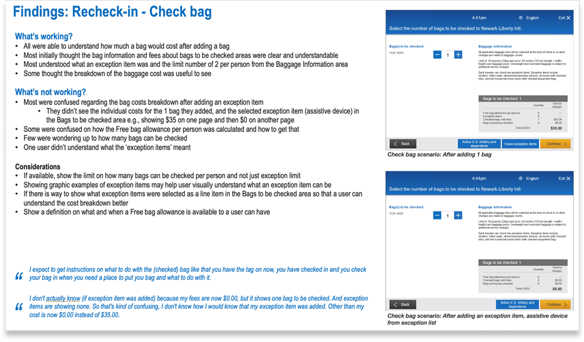
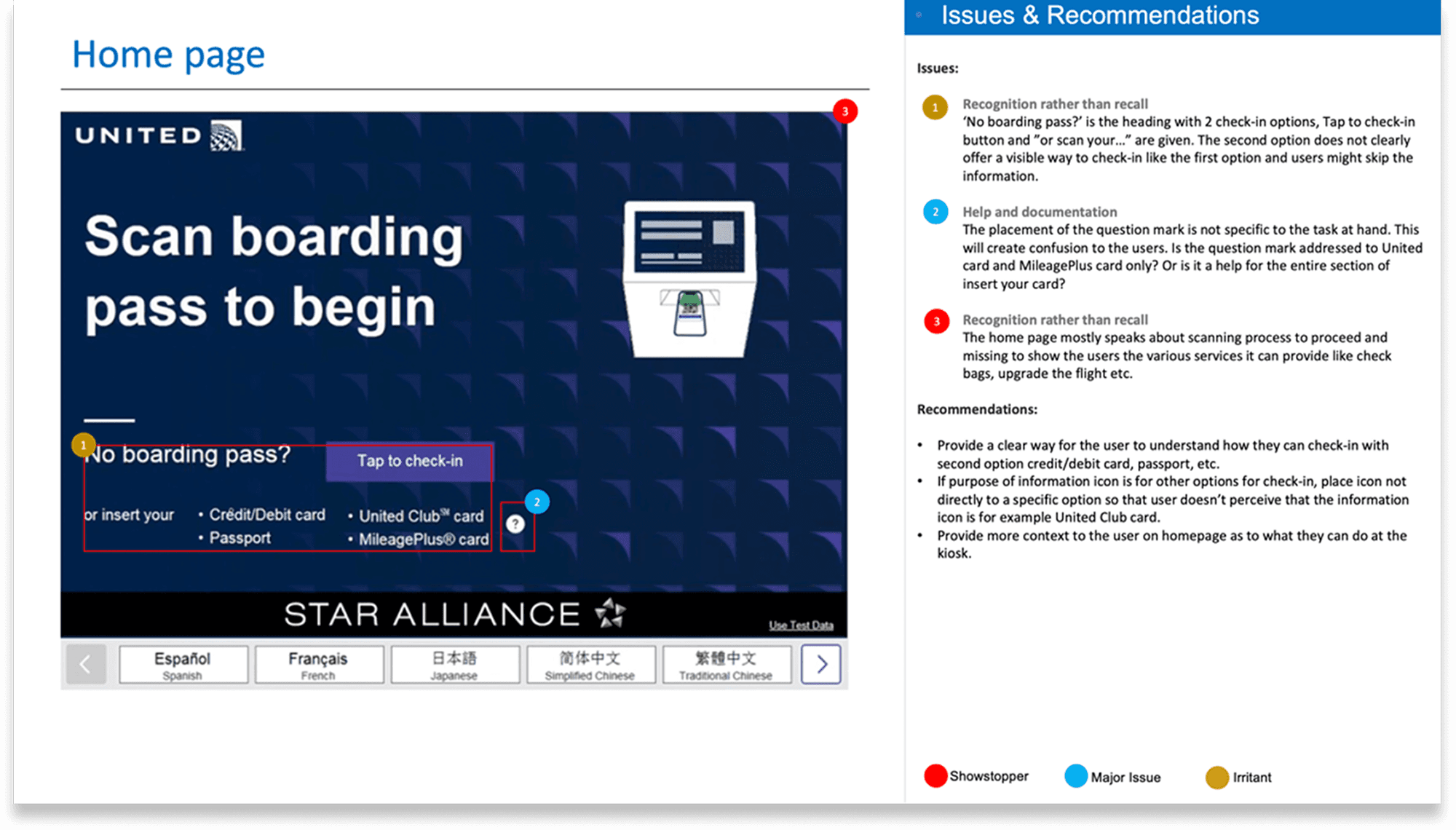
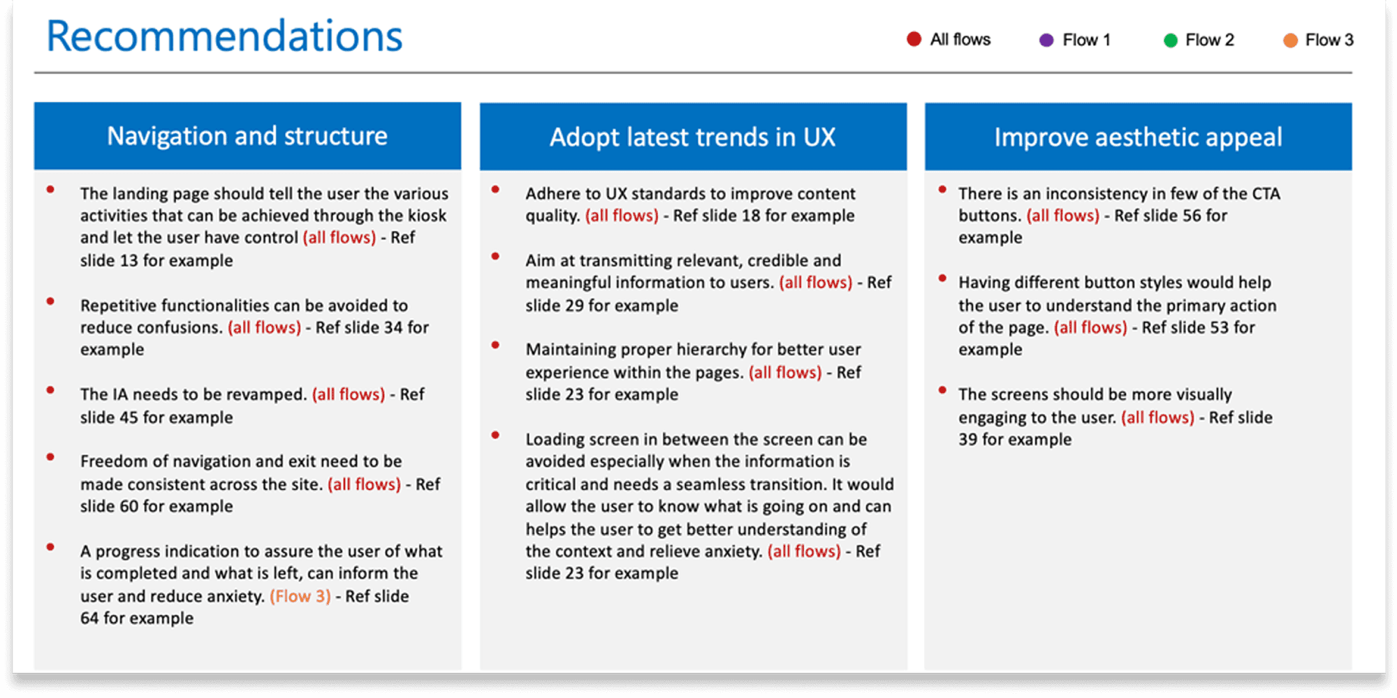
Before designing anything new, I needed to understand exactly how the existing system was failing. I ran a full heuristic evaluation against Jakob Nielsen's 10 usability principles.
Principles violated | What it meant for the passengers |
|---|---|
Visibility of system status | 5–10 second processing pauses with no feedback. Passengers froze, unsure if it had crashed |
Match with real world | Airline jargon passengers couldn't parse. "Involuntary downgrade protection" instead of "lock in your seat now" |
User control and freedom | No back navigation without starting over. One wrong tap meant restarting the entire check-in |
Consistency and standards | Buttons changed size, color, and position across screens. Every screen required re-orienting |
Error prevention | Asked passengers to confirm information they didn't have in front of them |
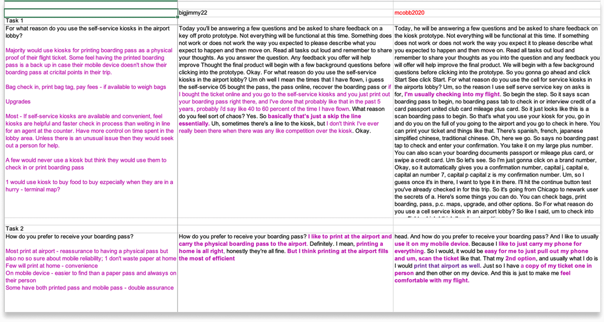
Working alongside the US strategy team gave me something desk research never could; the mental model of a real stressed traveler. Not a persona. Not an assumption. Direct field insight from the people who watched passengers use these kiosks every day.
Designing complexity as the default
Most kiosk redesigns would have done this: optimise the simple journey and accommodate complexity as edge cases. I did the opposite.
I designed assuming complexity was the norm and made simple cases feel effortless within that system. If the design worked for a military passenger with special baggage allowances traveling internationally with a non-standard booking, it would work for everyone.
The key decisions
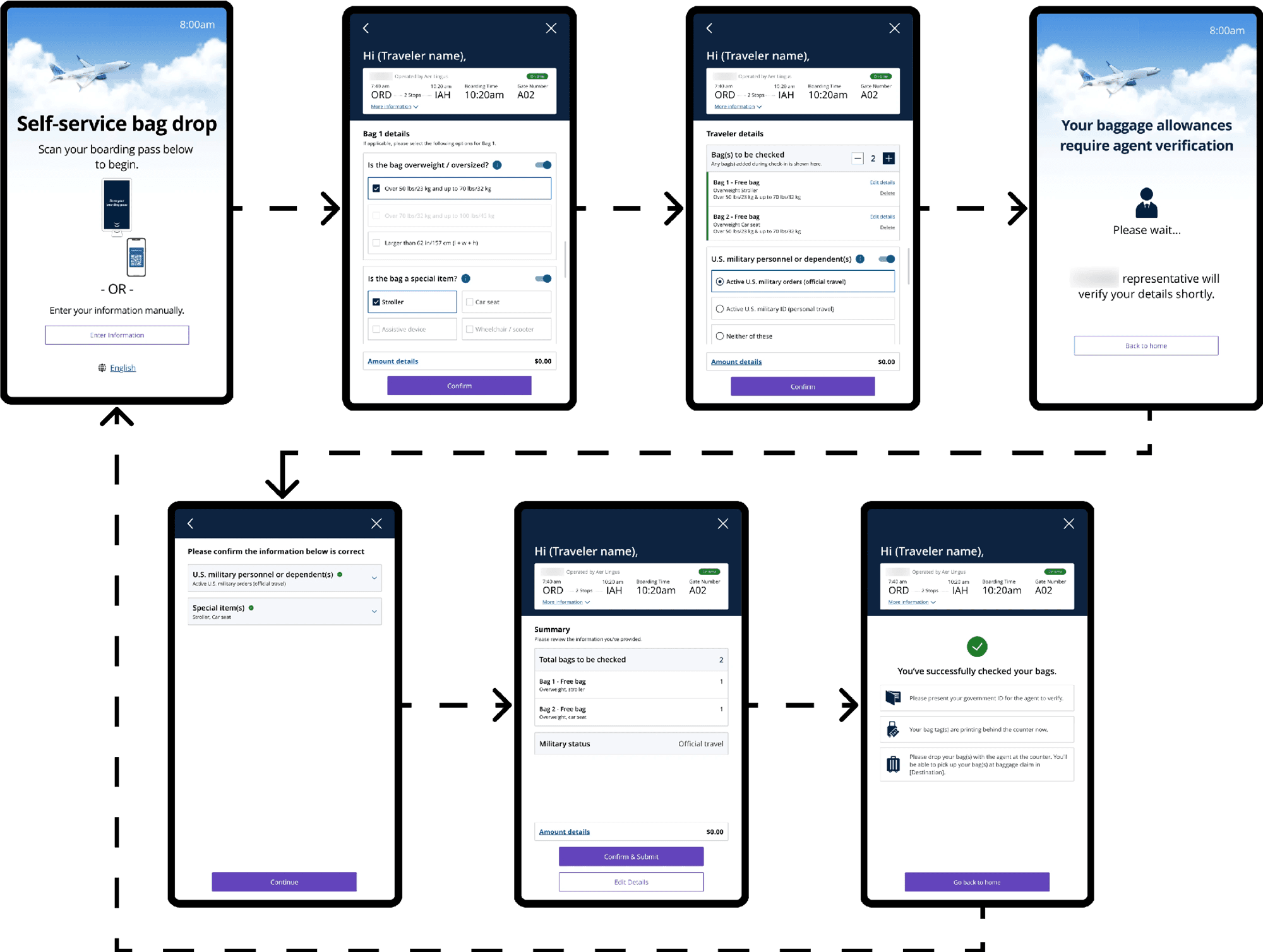
Collapsed complexity by default
Flight information, documentation requirements, special allowances, all collapsed until a passenger needed them. The default view answered one question: am I good to go, or is there something I need to fix? Everything else was one tap away, not one screen of dense text away.
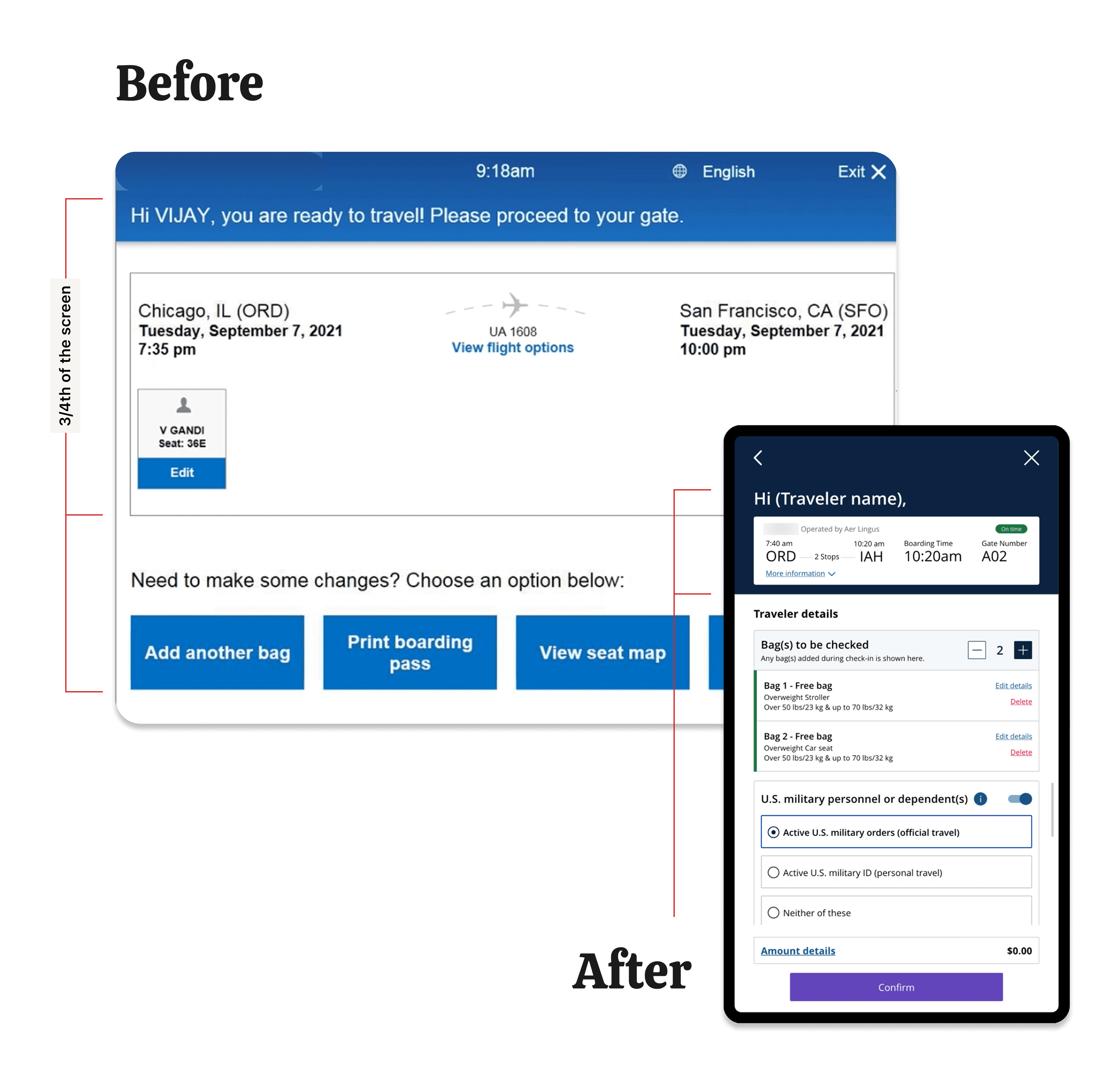
Translate, don't abbreviate
Every piece of airline jargon was rewritten in passenger language. Not "involuntary downgrade protection", but "Lock in your seat assignment now." Not "additional documentation required", but "You'll need to show your visa at the gate. Here's exactly what to bring." The system stopped assuming passengers knew the airline's internal language.
Honest about what the kiosk can't do
The biggest frustration for international passengers was document verification. They wanted the kiosk to confirm their visa and say "you're good." It can't. Verification requires government database integrations that a kiosk redesign can't solve.
Rather than pretending to verify through meaningless confirmation checkboxes, the redesigned flow said clearly: "Our agents will verify your travel documents at the gate. Make sure you have [specific items] with you." Honest design over false confidence.
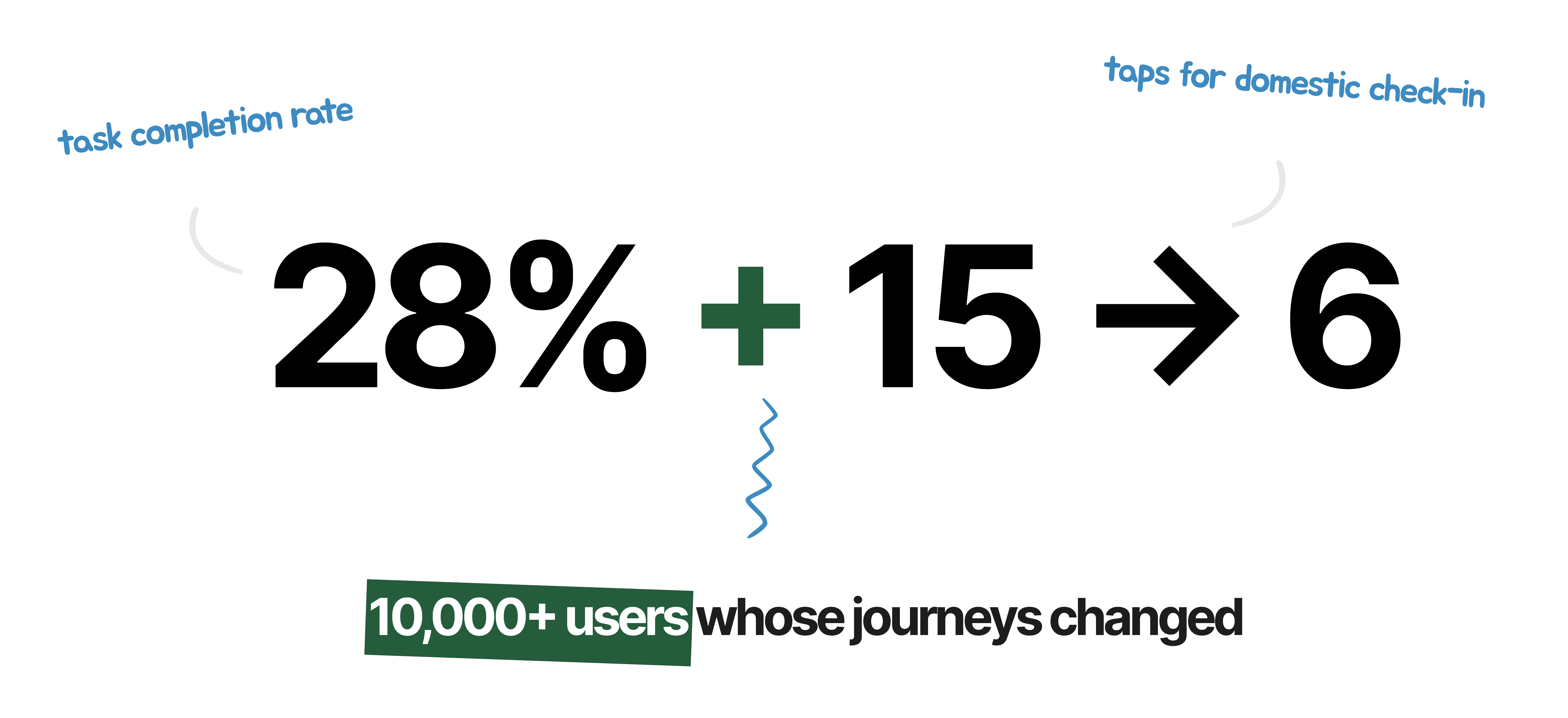
The redesigned flow cut domestic check-in from 12–15 taps to 6–8. International flows were significantly reduced. Passengers who previously abandoned mid-flow now completed check-in at the kiosk.
What changed
The kiosk went from a tool that worked for passengers who didn't need it, to one that worked for the passengers who needed it most.
What changed beyond numbers
The passengers who were previously invisible in the data, the international travelers, the military personnel, the families with complex bookings, started completing check-in at the kiosk instead of joining the agent line. That shift didn't just improve their experience, it reduced queue pressure at the counter for everyone.
What I carry forward
This project permanently changed how I read data. Usage metrics only capture what happened. They can't capture what didn't. Smooth completion rates hide the passengers who gave up before the data could record them.
Now I always ask: who is this data not showing me? What does the absence of certain users in the numbers actually mean? The people missing from your metrics are often the people your design is failing most.