100 apps in 100 days: I Didn't Design 100 Apps. I Designed the System That Made Them Possible
Design Framework | Scale
I created a reusable integration framework that enabled Freshworks to ship 100 third-party app integrations in 100 days, while maintaining design coherence across wildly different use cases, timelines, and developer constraints.
The Core Challenge: Freshworks wanted to position itself as a "one-stop solution" for support agents, which meant integrating everything from shipping trackers to payment processors to CRM tools. But every integration was being designed differently, creating a fragmented experience where the same action (tracking a shipment, processing a refund) felt completely different depending on which company's integration you were using.
My Approach: Instead of designing 100 unique experiences, I created a structural framework that standardized the container while leaving the content flexible. This allowed multiple PM and developer tracks to move in parallel without constant design bottlenecks, while ensuring agents always knew where to look and how to interact.
The Impact: We hit the 100-app goal on schedule. The framework became the default pattern for all future integrations. But the real lesson? Designing at velocity isn't about moving faster, it's about building systems that let others move faster while you protect the UX coherence.
What Was Actually Broken (And Why Speed Made It Worse)
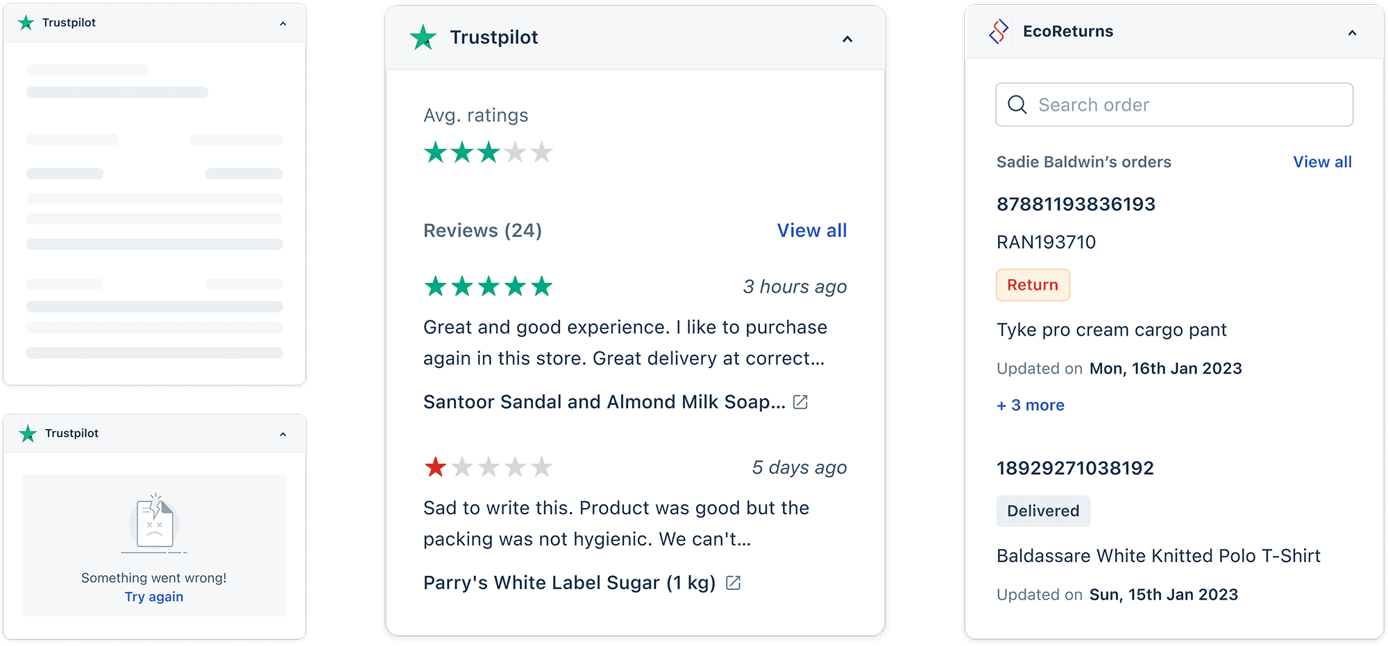
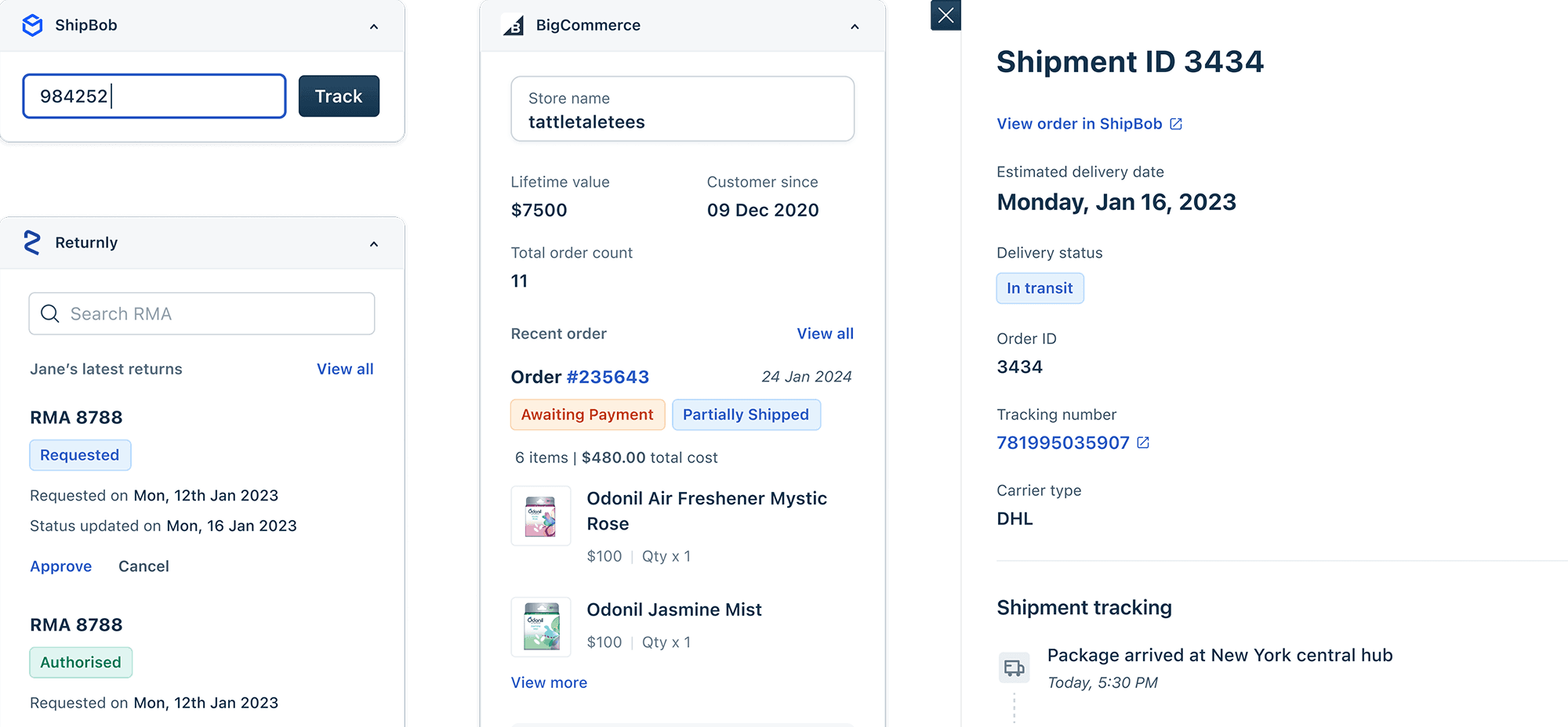
When I joined this project, Freshworks had already integrated a few third-party apps. Each one worked, technically. But the experience was chaos. Here's what the same category of integration looked like across different vendors:
Shipping Integration A:
Tracking info appeared in a right-side panel
Status updates shown as a timeline
Actions (print label, request pickup) in a dropdown menu at the top
Shipping Integration B:
Tracking info appeared in a modal overlay
Status updates shown as a list with icons
Actions (print label, request pickup) as individual buttons at the bottom
Shipping Integration C:
Tracking info appeared inline within the ticket
Status updates shown as a progress bar
Actions (print label, request pickup) in a contextual menu you had to right-click to find
All three integrations did the same thing - help agents track shipments and take shipping-related actions. But an agent switching between FedEx, UPS, and DHL customers had to relearn the interface each time.
The real problem
Each integration was being designed by different PMs with different priorities, different developer constraints, and different timelines. There was no shared system, no design language, no consistency.
And now we wanted to add 80+ more integrations in 100 days.
Without intervention, this would become completely unmanageable. Agents would spend more time figuring out how to use integrations than actually using them. The "one-stop solution" promise would become a nightmare of cognitive overhead.
This created several cascading problems:
Problem 1: No Time for User Research Per Integration
In a normal design process, I'd research each integration category:
Interview agents about how they currently handle shipping, payments, CRM lookups
Observe workflows to understand mental models
Test prototypes to validate design decisions
With 100 apps and 100 days, that wasn't feasible. I had maybe 4–5 days per integration, including design, review, and handoff to developers.
Problem 2: Each PM Had Different Priorities
I was working with multiple PMs simultaneously, each owning a different category (shipping, payments, customer data, productivity tools). Each PM had their own vision for what their integrations should and could do and how they should look.
Problem 3: Developer Constraints Varied Wildly
Some integrations were being built by experienced frontend developers who could implement complex UI patterns. Others were being built by backend engineers who were less comfortable with frontend work.
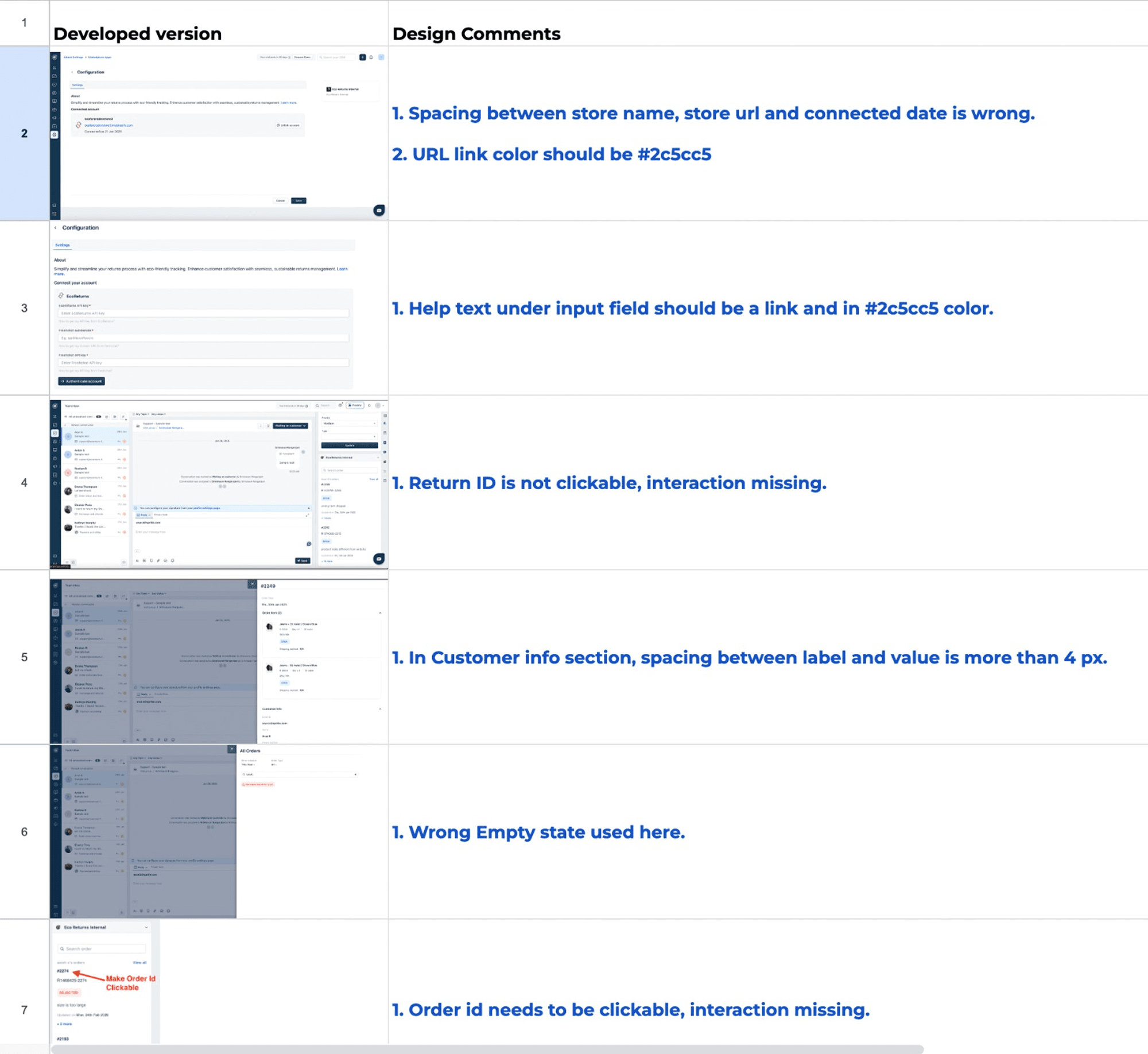
This meant: Even if I designed something consistent, implementation quality varied dramatically. Some integrations matched my designs perfectly. Others had spacing inconsistencies, misaligned buttons, wrong font weights, small issues that compounded into a fragmented experience.
Problem 4: I Became the Bottleneck
Every integration needed design review. Every PM wanted my input on their specific use case. Every developer had questions about implementation.
I was spending 60% of my time in meetings and Slack conversations, 30% doing visual QA to catch UI discrepancies, and only 10% actually designing.
The Framework That Solved This (And Why It Worked)
I stopped designing individual integrations and started designing the container all integrations would live within.
The insight came from observing agents switching between integrations. They weren't confused by what information was shown, they were confused by where to look for it and how to interact with it.
So I standardized:
Where integrations appear (always in a right-side panel, consistently sized and positioned)
How information is organized (header with integration logo and status, body with primary content, footer with actions)
How actions work (primary actions always buttons in footer, secondary actions in overflow menu)
Visual hierarchy (typography scale, spacing system, color usage)
And I left flexible:
What information is shown (shipping integrations show tracking timelines, payment integrations show transaction history)
What actions are available (depends on the integration's capabilities)
Visual style within the content area (as long as it followed our typography and color system)
The Three-Zone Structure
Every integration followed the same template:
Zone 1: Header (Standardized)
Integration logo (always left-aligned)
Search (if technically feasible)
"view more" (always top-right corner) - which will open a slider from the widget
Zone 2: Body (Flexible)
Primary content area
Follows typography scale and spacing system
Can contain any information structure (lists, timelines, forms, data tables)
Must use approved components from our design system
Zone 3: Footer (Standardized)
Primary action button (always right-aligned, same styling)
Consistent spacing and height
The result: Instead of being a bottleneck, I became a quality gate. I could review 10 integrations in the time it used to take me to design one from scratch.
Another win: It Helped Developers Collaborate
Because every integration used the same structure and components, developers started helping each other. Before the framework, every integration was custom-built. After the framework, developers could reuse code across integrations, which sped up development and improved consistency.
The Impact (And What I'm Proud Of)
We shipped 100 integrations in 100 days. Freshworks positioned itself as a one-stop solution for support agents. The framework became the standard for all future integrations.
But the impact I'm most proud of:
I didn't just design 100 integrations, I designed the system that made 100 integrations possible. That's leverage. That's strategy. That's the kind of design thinking that creates lasting value beyond any individual project.
And I learned that constraints enable creativity. The tight timeline and limited resources forced me to think systematically rather than incrementally.
When I approach high-velocity projects now, I ask:
What's the pattern, not just the solution?
How do I design the system that lets others work independently?
What constraints will enable clarity and consistency?
How do I protect quality without becoming a bottleneck?
This project taught me that senior design work is about creating leverage. Building systems, frameworks, and patterns that multiply the impact of everyone around you.
That's the designer I want to be. Not the one who can design the most features, but the one who can design the system that makes everyone else more effective.


