From 15 Taps to 6: Reducing Complexity for International Travelers Through Heuristic-Driven Design
Service Design | Inclusive Design
I redesigned the airport self-service kiosk experience for international flyers with complex documentation, military personnel with special allowances, and families with non-standard booking situations.
The Core Challenge: The legacy kiosk technically supported edge cases, but the experience was so confusing and time-consuming that passengers gave up and joined the already-long agent counter lines. The kiosk was supposed to reduce wait times but instead, it was creating bottlenecks.
My Approach: I conducted a heuristic evaluation that systematically tore apart the existing flow, then rebuilt it around a stressed passenger's mental model. Fewer clicks, collapsible complexity, and a flow that assumed "something is probably non-standard" rather than treating edge cases as exceptions.
The Impact: Check-in time decreased significantly. Fewer clicks, clearer decision points, and a system that finally worked for the passengers who needed it most. But the bigger lesson? Sometimes the best design work is removing the complexity that shouldn't have been there in the first place.
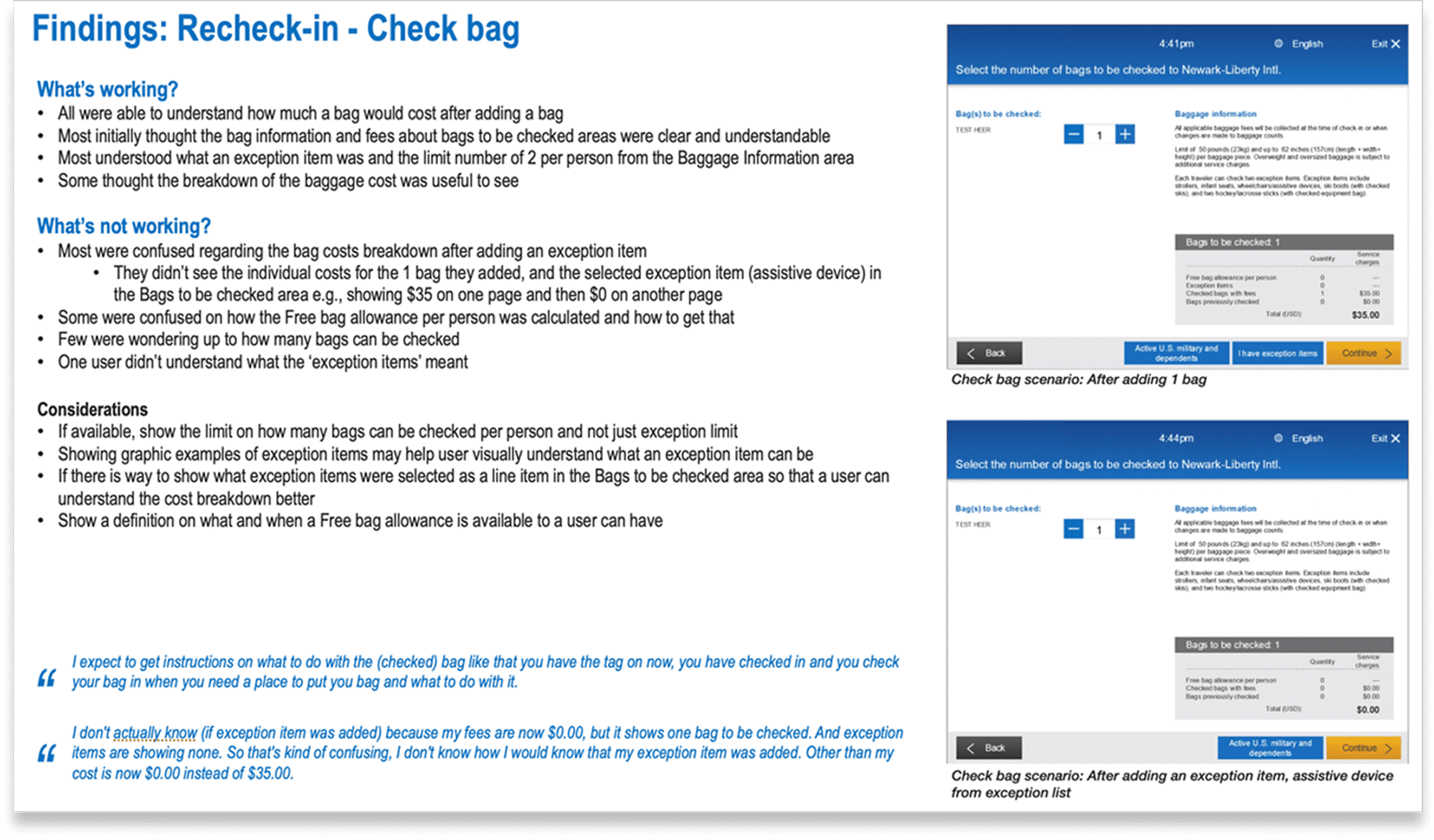
What the Legacy Kiosk Actually Supported (And Why That Was the Problem)
When I started this project, the brief was deceptively simple: "Improve the kiosk check-in experience."
But when I examined the existing system, I realized the problem wasn't what it couldn't do, it was how it forced users to navigate what it could do.
The legacy kiosk technically supported:
International travel with multiple document types
Military personnel with baggage allowances and fee waivers
Group bookings with seat reassignments
Special items (sporting equipment, musical instruments, medical devices)
Manual overrides for edge case scenarios
But here's what it actually felt like to use:
Every edge case was treated as an exception that required navigating through redundant screens, re-entering information the system should have already known, and making binary decisions without enough context to understand what you were choosing.
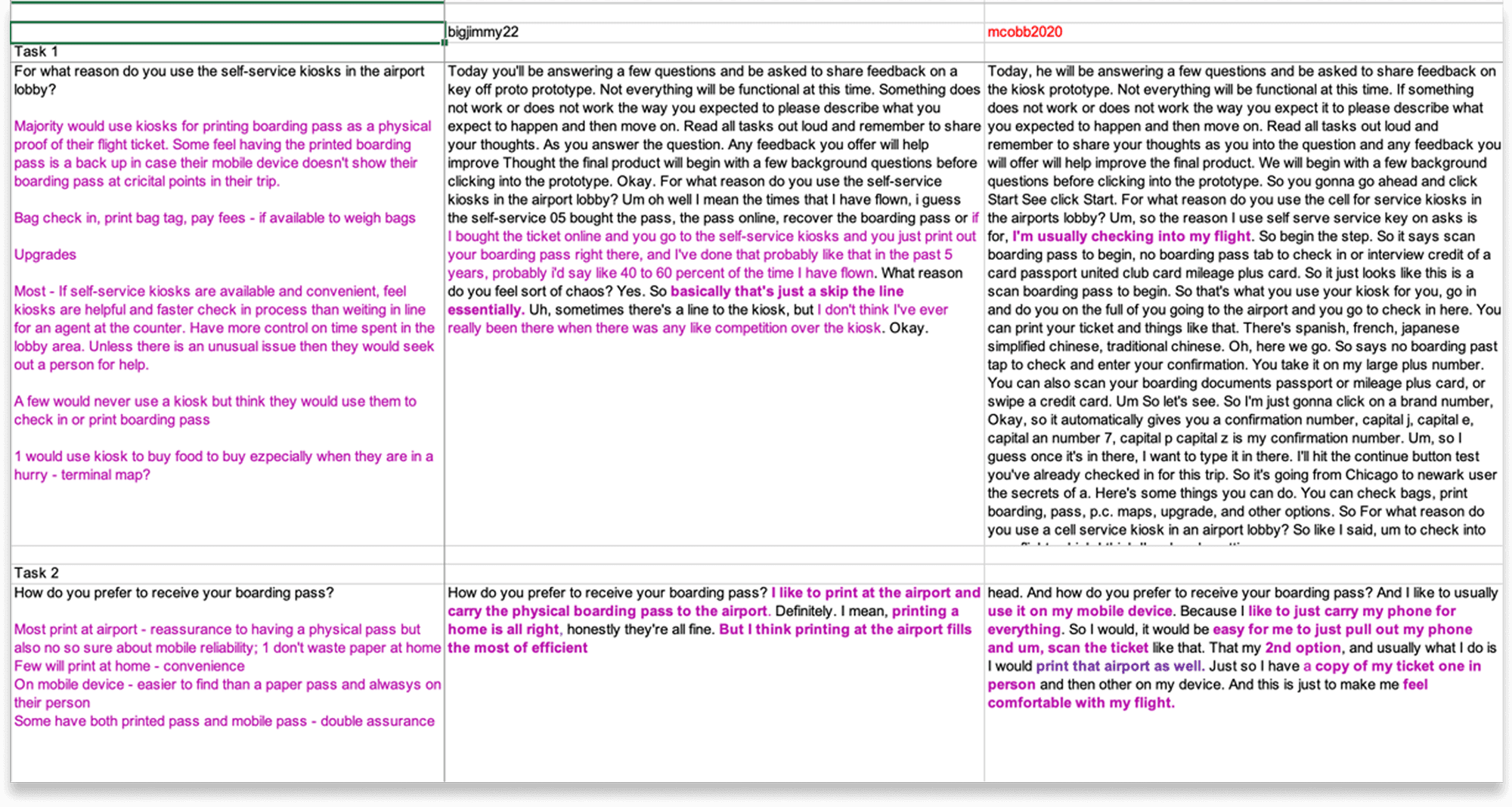
Who Was Suffering Most (And Why They Were Invisible)
When you design for "average users," you inevitably optimize for people who already have the easiest experience like frequent business travelers with simple itineraries, domestic flights, and no special requirements.
But the people who needed the kiosk most were being failed by it:
International Passengers: Multiple ID types, visa requirements, vaccine documentation, customs declarations.
Military Personnel: Special baggage allowances, fee waivers, flexible ticket rules. The kiosk would sometimes ask them to pay fees they shouldn't be charged, forcing them to abandon the kiosk and wait in line to get an agent to override it.
Non-Standard Bookings: Families traveling together with seats scattered across the plane. Group bookings where one person checked in but others hadn't yet. Passengers with special items that didn't fit the standard baggage categories.
These weren't rare edge cases
At a major hub airport, 30–40% of passengers have at least one non-standard element to their booking. But the kiosk was designed as if 95% of passengers were identical and 5% were "exceptions."
The insight that changed my approach: Instead of designing for the happy path and accommodating edge cases, I needed to design assuming complexity as the default and make the simple cases feel effortless within that system.
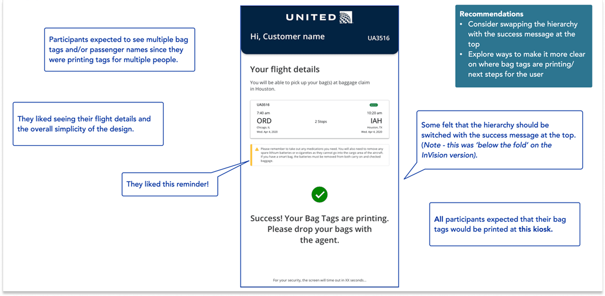
The Heuristic Evaluation That Became My North Star
I conducted a systematic heuristic evaluation of the existing kiosk flow against Jakob Nielsen's 10 usability principles.
Violation 1: Visibility of System Status
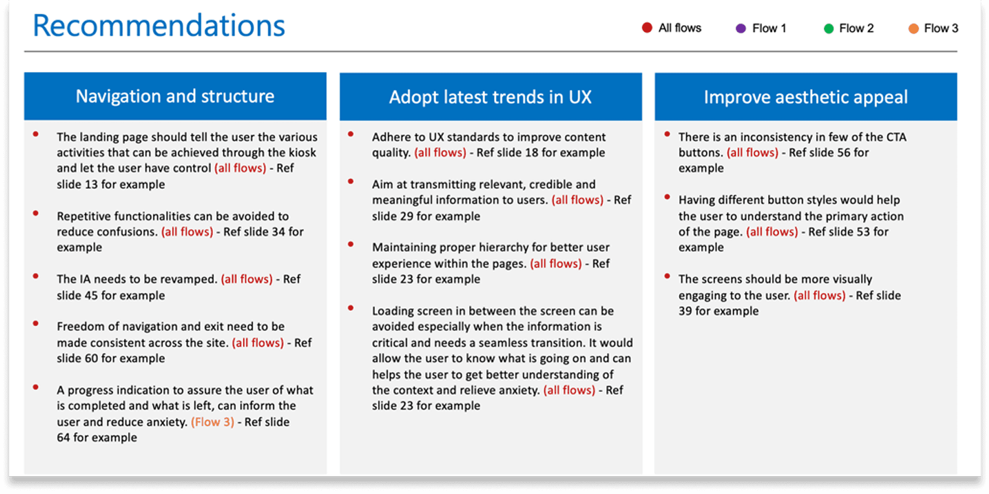
The kiosk would process information for 5–10 seconds with no indication of what it was doing. Passengers stood there wondering if it froze, if they should tap something, if they did something wrong.
My recommendation: Every processing moment needed a clear status indicator: "Checking your booking..." "Verifying passport..." "Confirming seat availability..."
Violation 2: Match Between System and the Real World
The kiosk used airline terminology that passengers didn't understand. "Do you wish to proceed with involuntary downgrade protection?" What does that even mean?
My recommendation: Translate airline operations language into passenger concerns. Instead of "involuntary downgrade protection," say "Lock in your seat assignment now" with an explanation of why it matters.
Violation 3: User Control and Freedom
If you made a mistake three screens back, there was no clear way to go back and fix it without starting over. Passengers felt trapped in a flow they couldn't escape.
My recommendation: Clear back navigation at every step, with the ability to return to any previous decision without losing progress.
Violation 4: Consistency and Standards
Buttons were of different sizes and positions across screens. Sometimes "Next" was green, sometimes blue, sometimes in the bottom right, sometimes centered. Every screen required re-orienting.
My recommendation: Standardized button hierarchy, consistent positioning, predictable interaction patterns.
Violation 5: Error Prevention
The system asked passengers to confirm information they often didn't have in front of them, then blamed them when they got it wrong.
My recommendation: Only ask questions passengers can reasonably answer in the moment. Pre-populate everything the system already knows. Provide inline help for confusing requirements.
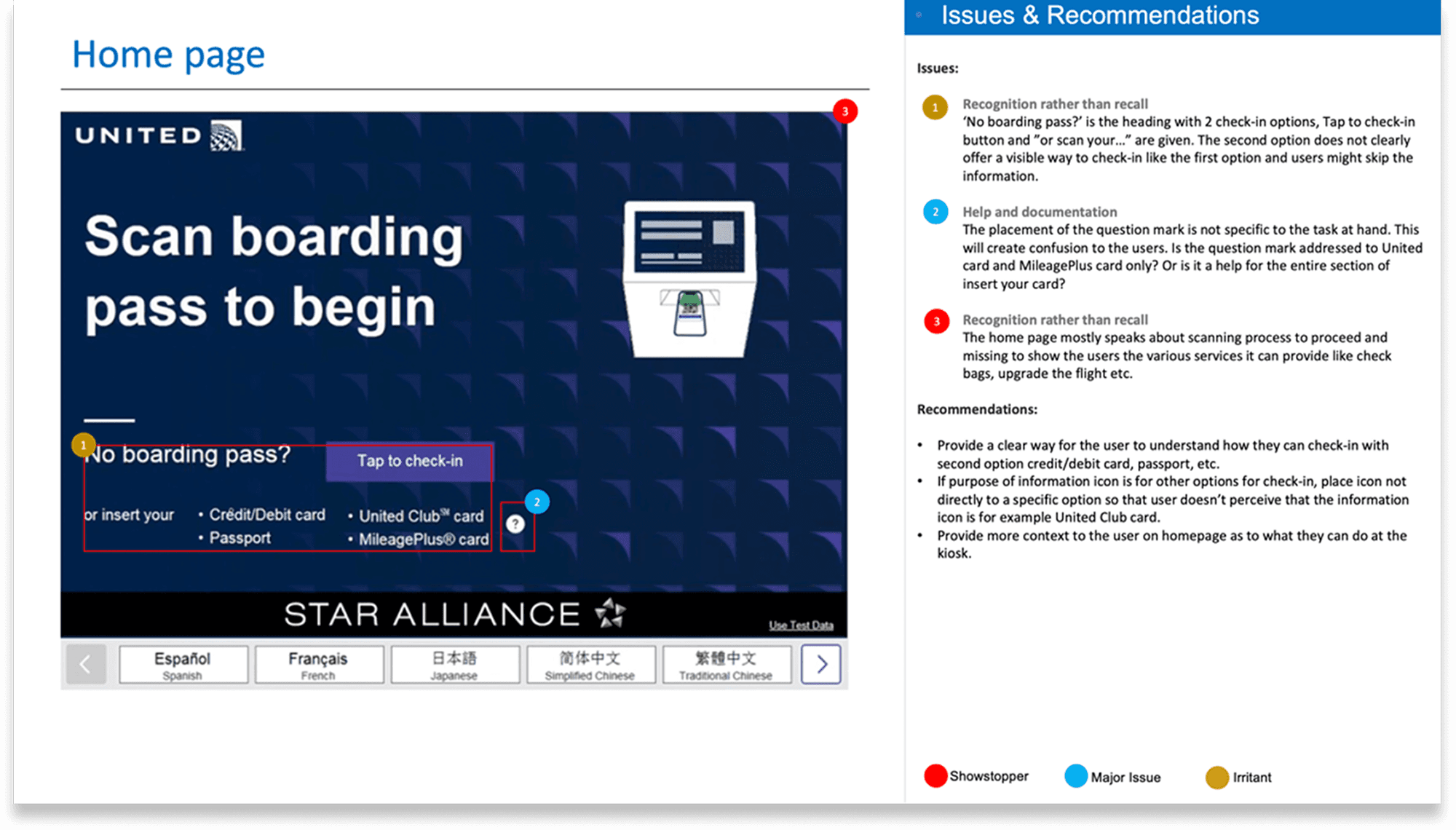
The Battle Over Flight Information Display
What the legacy system did: Showed full flight details (departure time, arrival time, gate, aircraft type, seat assignment, baggage allowance) on one dense screen that passengers had to read through before proceeding.
What I designed:
Default view (collapsed)
Expanded view (only if passenger taps)
Why this worked: It optimized for the mental model of a stressed passenger who wants to know: "Am I good to go, or is there a problem I need to fix?"

What Actually Improved in the Redesigned Flow
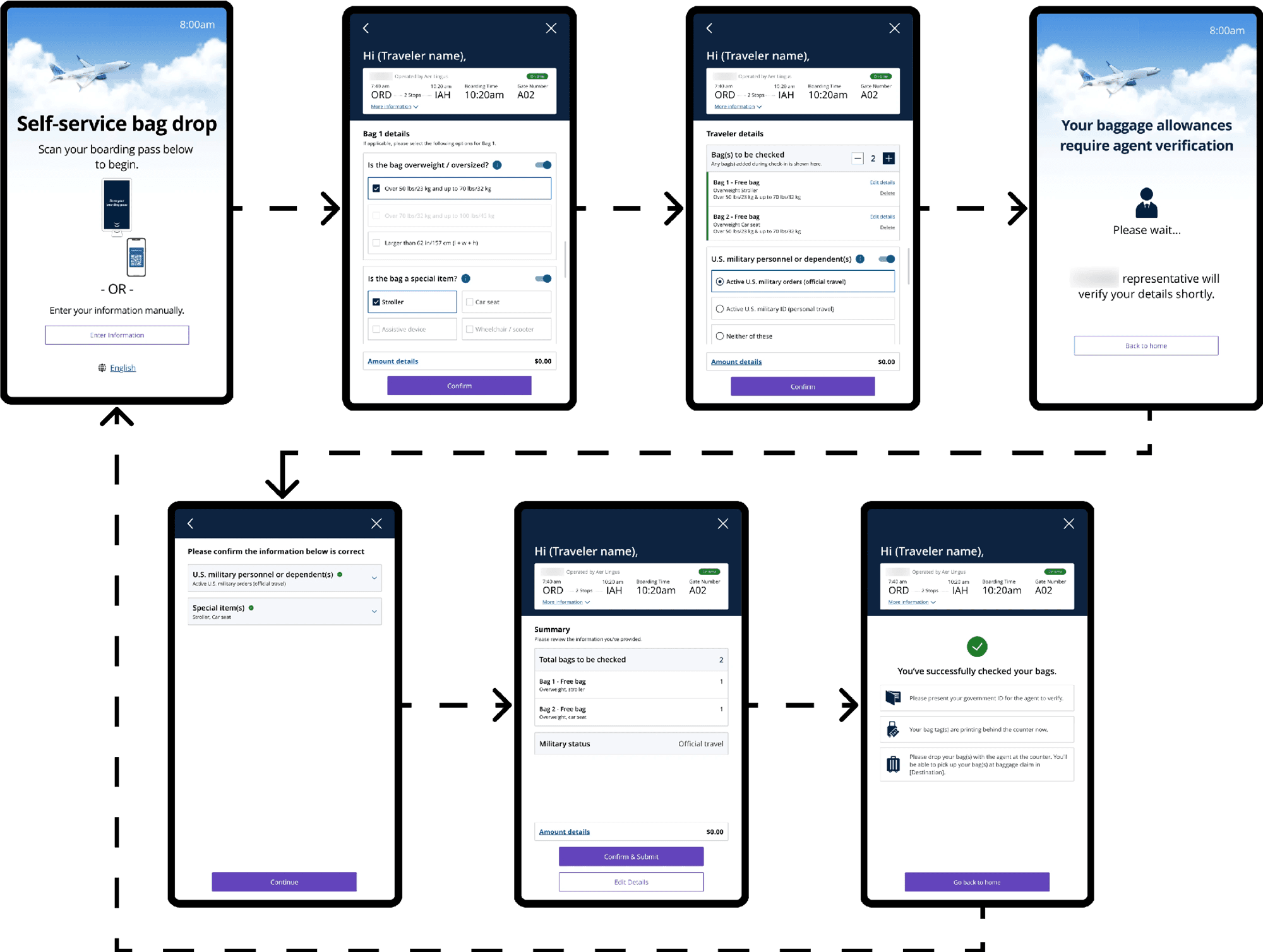
Fewer Clicks, Faster Check-In
The legacy flow required an average of 12–15 taps to complete check-in for a standard domestic flight. For international passengers, it could be 20+ taps.
The redesigned flow: 6–8 taps for domestic, 10–12 for international.
What I Couldn't Solve (And Why That's Important to Name)
The System Still Couldn't Verify Documents Automatically
The biggest frustration for international passengers was document verification. They wanted the kiosk to scan their passport and visa and say "you're good to go" or "there's a problem."
Why we couldn't solve this: Document verification requires integrations with government databases, visa systems, and international travel authorization programs. That's an infrastructure and legal challenge far beyond the scope of a kiosk redesign.
What I did instead: I made the kiosk honest about its limitations. Instead of pretending to verify (through meaningless confirmation checkboxes), the redesigned flow said clearly:
"Our agents will verify your travel documents at the gate. Make sure you have [specific requirements] with you."
The lesson: Sometimes good design is about being transparent about what the system can't do, rather than creating false confidence about what it can.
How Working with US Strategists and Field Insights Changed Everything
This project was unique because I wasn't designing with US based strategy team and had access to field data from actual airport kiosks including usage patterns, abandonment rates, and agent notes about why passengers were giving up.
What the strategists taught me:
1. The mental model of a stressed traveler
"Real passengers are stressed, running late, worried about missing their flight, possibly traveling with kids or elderly parents. They're not reading. They're scanning for 'is this the right button to tap?"

